Field Types
The Feelbettr system comes complete with 11 types of form fields. These form fields include:
- textarea
- input
- checkbox
- heading
- paragraph
- divider
- radio
- select
- button
- link
- gallery
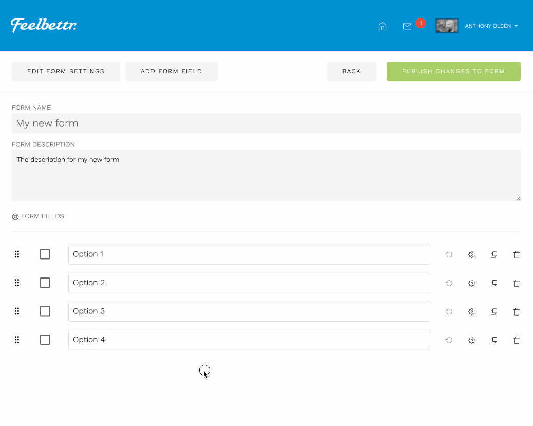
Editing Field Options
Field types can be edited in place in the form editor or alternatively in the side panel when clicking on the gear icon that corresponds to that field.

Please note that the edit in place option is only available for textarea, input, checkbox, heading, paragraph and gallery fields.
Field Options
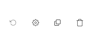
The image above shows the 4 options available when viewing or editing a field.
-
recycle arrow is displayed when there are changes that have not yet been published to the form. Clicking this will revert the field to the previously saved state.
-
Cog icon when clicked will reveal the settings panel for that field.
-
Duplicate icon when clicked will duplicate the field directly below that field.
-
Delete Icon when clicked will delete the field. This is a destructive process and can not be reverted.
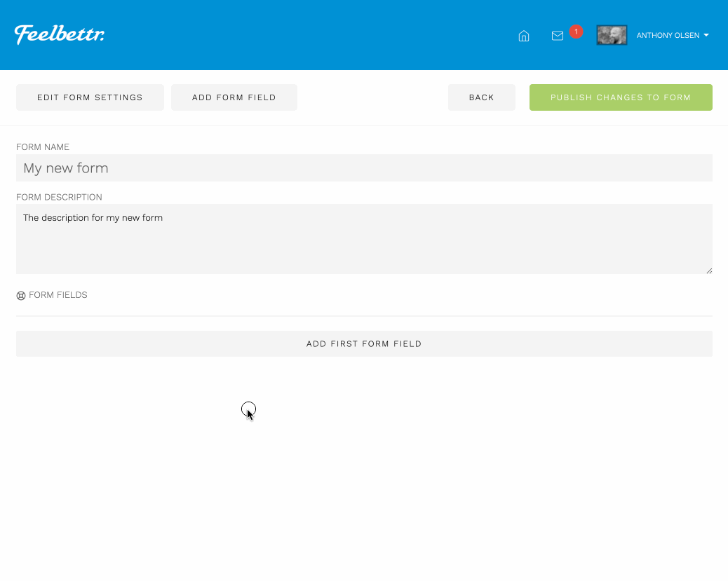
Reorder Fields
All of the fields in the form can be reordered. To do this click and hold the left re-order icon as per the video below.
Textarea
Description:
Used to collect longer form answers and data.
Example

Options
- label
- required field
- hide the label
- placeholder text
- help text
Input
Description:
Used to collect shorter answers and data.
Example

Options
- label
- required field
- hide the label
- placeholder text
- help text
Checkbox
Description:
Used to allow the user to specify whether something applies to them or not by checking or unchecking a box.
Example

Options
- label
- required field
- placeholder text
- help text
Heading
Description:
Used as a display item in the form to create a heading for a section.
Example

Options
- label
- help text
Paragraph
Description:
Used as a display item to provide information about a particular section or question in the form.
Example

Options
- label
- help text
Divider
Description:
A display item used to separate sections from each other
Example

Options
- label
- hide label
- help text
Radio
Description:
A group of inputs that allow the user to select one item from a group of options.
Example
Options
- label
- required field
- hide label
- radio options - (enter each option on a new line)
- help text
Select
Description:
A selection box provides multiple options for a user to choose from in a drop down format.
Example
Options
- label
- required field
- hide label
- select options - (enter each option on a new line)
- default text - (the text to show to the user when no option is selected)
- help text
Button
Description:
Used as a display item to allow the user to view a nother webpage in a button format.
Example

Options
- label
- link destination
- help text
Link
Description:
Used as a display item to allow the user to link to another webpage in a link format.
Example

Options
- label
- link destination
- help text
Gallery
Description:
A display item used to show images associated with a tag as per the tagging instructions in the media manager.
Example
Options
- label
- hide label
- help text
- image tag to display images from
- image size