Main content
- Overview
- Introduction Block
- Description Block
- Payment Block
- Cancellation Block
- Location Block
- Speakers Block
- Gallery Block
- Sidebar Image
- Sidebar contacts
- Booking button
- Adding and Removing Blocks
- Reordering Blocks
Overview
This section refers to the content in an event below the header and in the main column. It includes the following blocks:
- Introduction
- Description
- Payment
- Cancellation
- Speakers
- Location
- Gallery
Introduction Block
The event introduction is a line of text that can be used to give an overview of the event. This field only accepts text and is not able to receive any html formatting.
The introduction is used in a number of places on your website depending on how you are displaying events.
Editing the introduction
To add the event introduction simply type directly into the space available.

Once you have added the content required for the introduction you will need to save the event at the top of the page to view the changes on your website.
The introduction can be seen in multiple places across your website.
1. Introduction in the event stub in a grid widget

2. Introduction in the event on the public website

3. Page Meta Description
The introduction is also used as the page meta description if the page description has not been set. See the article on the settings panel to understand more about this.
<meta name="description" content="We invite you to participate in ..."/>
Description Block
The description block holds the majority of the content for your event. The description accepts a wide variety of html formatting for the user such as headings, lists, links etc
Using the editor
Setting default values for the description
Payment Block
The payment block is an editable textarea that can be used to display any relevant information regarding payment of your event.
The payment block has the added feature of being able to insert the users default payment details into the payment block. The users default payment options can be added in the profile settings page in the dashboard.
Cancellation Block
The cancellation block is an editable textarea that can be used to display any relevant information regarding the cancellation policy for your event.
The cancellation policy has the added feature of being able to insert the users default cancellation policy in the cancellation block. The users default cancellation policy can be added in the profile settings page in the dashboard.
Location Block
Setting the location
The location block allows the user to specify the location for the event. If the event does not yet have a location the location drop down will be shown whereas if there is a location set then the map of the location will be visible as well as the instructions for the location if they are populated and the display location instructions is checked.

Speaker Block
It is possible to assign three different categories of speakers for your event.
- Guest Speakers
- Featured Speakers
- Speakers
Depending on your system the label for speaker may be translated into another label such as facilitator or GTT Staff.
There are three blocks available to assign speakers to the event - guest speakers, speakers and featured speakers. If a team member is already assigned as a featured speaker they will not be available in the speakers drop down list nor in the guest speaker block.

Auto adding a speaker
When a speaker is assigned to an event their profile picture will show in the event as well as a truncated version of their bio. When the user clicks through to their bio it is possible to see any other relevant information as well as view any other events the speaker may be speaking at.
Speaker layouts
It is possible to display your speakers for an event in a number of different layouts. These include:
- List (Default)
- 2 column grid
- 3 column grid
- featured list - the first speaker image is 50% of the block width and the subsequent speakers use the typical list formatting
- featured
- profile images
When an event is first created the user who has created the event is automatically assigned as the speaker.
Gallery Block
The gallery block allows the user to display of grid of images associated with the event. The images that are displayed are determined by the use of a "tag" that can be used to group images.
Images can be tagged via the media manager

Setting the tag for the gallery and displaying the images
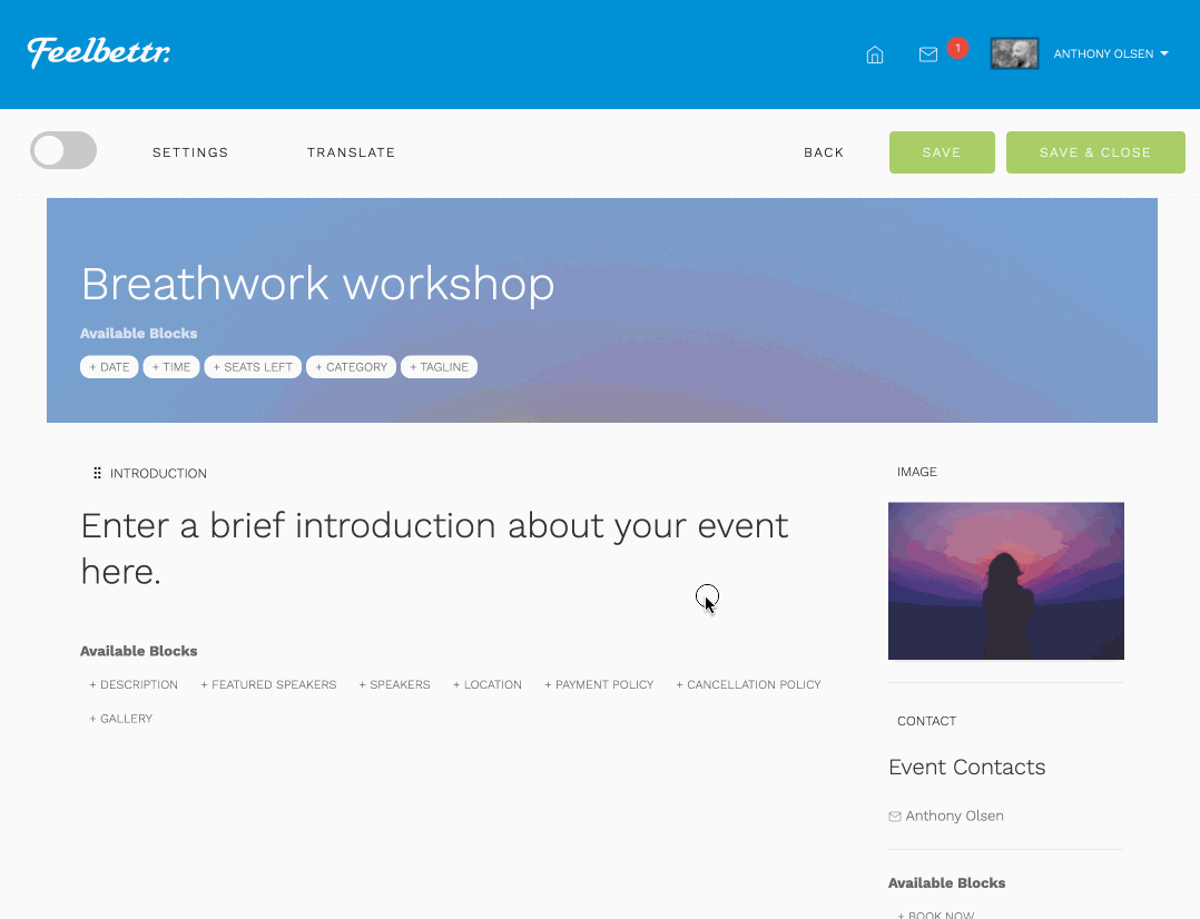
Image (Sidebar)
The Image block available in the sidebar allows the user to display an image on the page. When the user clicks the edit icon the image panel will show the image upload zone and display previously uploaded images from the users library.

Setting the sidebar image as the extract image
On occasion you may wish to use the sidebar image rather than the header image when displaying your event in a list. By defeault the header image is selected for use when your event is displayed in a collection of events ie a grid, list tec.

In order to display the sidebar image in the list rather than the header image please follow these steps:
- Go to the sidebar block and click the edit pencil
- Check the option that says Use as Extract Image
- Close the sidebar panel
- Save the event.
Contacts (Sidebar)
The contact block allows the user to display the name of the main contact's for the event.

Booking button (Sidebar)
The booking button can be used to connect the event to the relevant registration form or to click through to a manby inserted link. See the booking function help for more information regarding this.

Adding and removing blocks
Adding Blocks
Blocks of content can be added to the event by clicking on the available content block tags at the bottom of the page. After an item is added it is no longer listed int he vaailable blocks.

Removing Blocks
Blocks of content can be removed by clicking on the trash can icon that appears while hovering over the section you want to remove. After an item is removed it is now available int he available blocks list.

Reordering Blocks
Content blocks can be dragged and reordered by clicking on the label of the block and then dragging to the desired position.

When a block is reordered the order is automatically saved and there is no need to resave the event.